What History Shows Us About Home Values
The Headlines Focus On Short-Term Fear. History Tells A Much Bigger Story.
Most people focus on:
➡️ Today’s headlines
➡️ Today’s mortgage rates
➡️ Today’s market uncertainty
But housing markets have gone through:
➡️ Recessions
➡️ Inflation cycles
➡️ Housing corrections
➡️ Economic booms
➡️ Economic slowdowns
And despite all of it, long-term home values have historically trended higher over time.
The Headlines Focus On Short-Term Fear. History Tells A Much Bigger Story. — Core Strategy and Decision Context
The Headlines Focus On Short-Term Fear. History Tells A Much Bigger Story. — Core Strategy and Decision Context
Short-Term Markets Move. Long-Term Trends Matter Too.
Many buyers focus heavily on short-term market movements.
But historically, housing costs and home values have generally trended higher over longer periods of time.
That has been influenced by inflation, replacement costs, land constraints, population growth, and long-term housing demand.
Housing markets are not perfectly linear.
And there have absolutely been periods of correction and volatility, including during the 2007–2011 housing crash.
But historically, national home values have recovered and continued to trend higher over long periods of time.
One of the biggest reasons home prices remained resilient was the ongoing supply shortage.
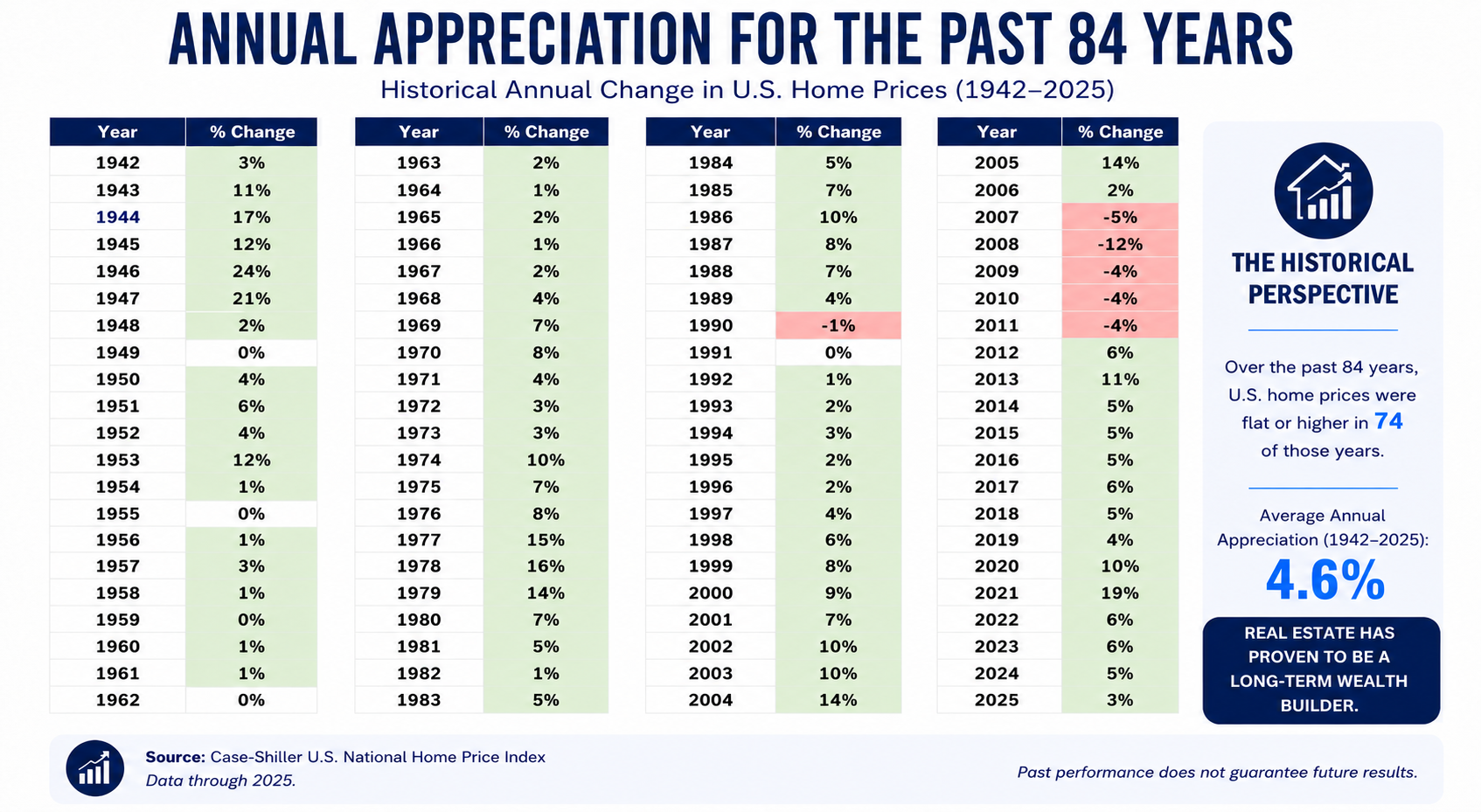
Annual Appreciation For The Past 84 Years
Annual Appreciation For The Past 84 Years
Home Appreciation Was Not Limited To One Market
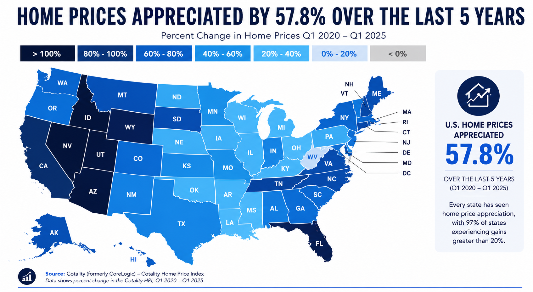
Nearly every state experienced meaningful home price appreciation between 2020 and 2025.
Some markets appreciated faster than others.
But nationally, housing values increased across the overwhelming majority of the country.
That helps explain why many homeowners today hold significantly more equity than they did just a few years ago.
It also reinforces that limited housing supply, strong demand, rising replacement costs, and constrained inventory continue to put upward pressure on home prices, even in a higher-rate environment.
Many people expected higher mortgage rates to cause home prices to fall nationally.
But in many markets, the supply shortage continued, limiting available inventory.
➡️ See: Why Do Home Prices Keep Rising?
Home Prices Appreciated by 57.8% Over The Last 5 Years
Home Prices Appreciated by 57.8% Over The Last 5 Years
Long-Term Ownership Historically Changed The Financial Equation
Over long periods of time, housing has historically appreciated across the overwhelming majority of U.S. markets.
That does not mean home values rise every single year.
And it does not guarantee future performance.
But historically, many homeowners who stayed in their homes longer benefited from long-term appreciation, equity growth, inflation-driven asset growth, and fixed housing payments, while rents continued to rise.
Over longer timelines, the financial gap often became substantial.
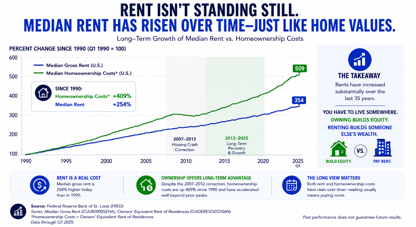
Rising Home Prices Often Meant Rising Rents Too
As home prices increased over long periods, rents historically increased too.
Rising home values, replacement costs, taxes, insurance, maintenance costs, and housing demand all influenced rental housing costs over time.
For many renters, housing costs continued to increase even as homeowners with fixed-rate mortgages maintained more stable long-term housing payments.
That does not mean homeownership is right for everyone.
But historically, both home prices and rents have generally trended higher over long periods of time.
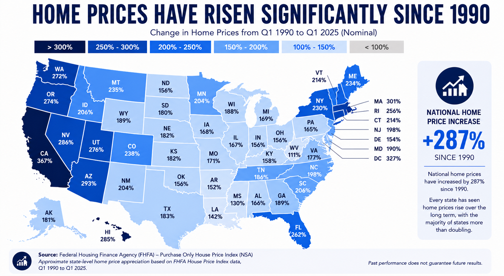
Home Prices Have Risen Significantly Since 1990
Home Prices Have Risen Significantly Since 1990
The Housing Market Constantly Changes. But Long-Term Perspective Matters Too.
Every housing market cycle feels different while you’re living through it.
Rates change. Inventory changes. Affordability changes. Economic conditions change.
And no one can perfectly predict the future housing market.
But history provides an important perspective.
Over long periods of time, housing costs, rents, replacement costs, and land values have generally moved higher while population growth continued to increase housing demand.
That does not mean every market performs the same. And it does not mean homeownership is the right decision for everyone.
But understanding long-term housing trends helps people make more informed decisions based on historical perspective instead of short-term fear, headlines, or outdated assumptions.
Every Buyer’s Situation Is Different
The housing market is complex.
And unfortunately, many buyers today are hearing conflicting opinions, emotional headlines, social media hot takes, and one-size-fits-all advice without ever being shown the full picture.
That’s why this presentation series was created: to help buyers better understand the bigger picture of housing affordability, competition, leverage, market psychology, mortgage rates, and long-term financial strategy, and how these factors often work together rather than focusing on only one piece of the puzzle.
Click the links below to continue exploring the Housing Market Series:
➡️ The Supply Problem Most People Don’t Realize Exists
➡️ Why Do Home Prices Keep Rising?
➡️ What Happens When Rates Drop?
➡️ Why Waiting Could Create More Competition
➡️ Why Today’s Buyers Still Have Opportunity
➡️ Today’s Buyers Have More Leverage Than They Think
If you’d like help understanding how these market dynamics may impact your specific situation, we’re happy to walk through the numbers with you and help you evaluate your options clearly and strategically.
➡️ Schedule Your Strategy Call Here
Best regards,
Michael Thayer, CMPS, CMA
NMLS #173264
Planet Home Lending, NMLS #17022
Explore Buyer & Seller Resources & Next Steps
+ −Market Timing vs. Market Strategy: When Is the Right Time to Buy... And More Importantly, Why?
Calculators & Loan Programs Questions Answered: Mortgage Programs & Financing Calculator
Smart Financing Strategies to Lower Your Monthly Mortgage Payment: Smart Mortgage Strategies & Financing Hacks
Homebuying Roadmap: Your Mortgage GPS
Moving To Middle Tennessee: Moving To Middle Tennessee Resource Center
Search Open Houses: View All Middle Tennessee Open Houses
Main Resource Hub: Buyers, Sellers, Realtors, and Builders Resources and Strategies
Additional Information & Reference Guides
+ −Welcome Video Transcript
+ −Video Transcript
00:00
One of the biggest fears many buyers have today is.
00:03
What if I buy at the wrong time?
00:06
And honestly, that's understandable!
00:08
Between the headlines, social media, and the constant market predictions, many people feel uncertain about where home values are headed. My name's Michael Thayer. I'm a mortgage advisor based in Nashville, Tennessee, serving clients nationwide. But when you take a step back.
00:25
And look at history, the house in history, over long periods of time.
00:30
A very different story starts to emerge.
00:34
Historical home values have generally trended upward over time, despite recessions, market corrections, higher interest rate environments, inflation cycles, and economic uncertainty.
00:50
That doesn't mean prices never fluctuate; they absolutely can.
00:54
But history shows us that real estate has typically been a long-term asset, not a short-term trade.
01:02
And one of the biggest mistakes that many people focus on and rely on.
01:06
Is short-term headlines rather than long-term trends.
01:12
That's exactly what this page was designed to help you explore. We walk you through historical home value trends, how different housing cycles impacted the market, and what happened during major recessions.
01:23
And why today's market may look very different from what many people assume.
01:28
Because understanding today's housing market starts with understanding what history has consistently shown us over time.
01:37
Real estate markets move in cycles.
01:40
But long-term housing demand has remarkably remained resilient.
01:45
So, take a few minutes to explore the information on this page, and if you'd like help understanding how today's market conditions, affordability, and long-term homeownership strategies may impact your goals, schedule a strategy call. Let's walk through what may make sense for you and your situation. Talk to you soon.
The Headlines Focus On Short-Term Fear. History Tells A Much Bigger Story. — Core Strategy and Decision Context Image Overview
+ −What this image communicates
The “The Headlines Focus On Short-Term Fear. History Tells A Much Bigger Story. — Core Strategy and Decision Context” image turns the central issue on “What History Shows Us About Home Values” into a visible central strategy. It is there to state the main tension clearly and show which decision should be made before secondary details distract from it, while the page supplies the evidence and explanation needed to evaluate what the chart or comparison says about supply, demand, prices, rates, equity, leverage, or competition at the geography and period actually measured. The image makes “The Headlines Focus On Short-Term Fear. History Tells A Much Bigger Story.” the dominant visual message and gives the reader a defined entry point into the page's argument. The wording identifies what deserves attention first; the surrounding design establishes whether the reader is looking at a claim, a choice, a sequence, or a practical resource. That distinction determines what evidence should be gathered before the message is applied.
Why it belongs on this page
This 84-year housing-history resource contrasts short-term fear with long-run price evidence. The central strategy role of “The Headlines Focus On Short-Term Fear. History Tells A Much Bigger Story.” is the reason this image belongs at this point in “What History Shows Us About Home Values.”
How a reader can use it
Use “The Headlines Focus On Short-Term Fear. History Tells A Much Bigger Story.” for its stated central strategy job on “What History Shows Us About Home Values.” Name the desired outcome, identify the constraint that could block it, and decide which evidence would change the answer. The working notes for this panel should record the desired result, the assumption carrying the most risk, the fact that would disprove it, and the decision that must be made first. That record lets the reader use market context to improve timing and negotiation questions without converting a broad statistic into a property-level prediction without asking this image to answer a different stage of the decision.
What still must be verified
The explanation around “The Headlines Focus On Short-Term Fear. History Tells A Much Bigger Story.” must remain inside the evidence available for this page. National or regional data cannot establish a specific home's value, condition, future appreciation, market time, offer activity, or the result of waiting. The “The Headlines Focus On Short-Term Fear. History Tells A Much Bigger Story. — Core Strategy and Decision Context” visual supports a better-informed conversation, while the actual decision remains tied to current evidence and the people authorized to interpret it. On “What History Shows Us About Home Values,” that safeguard applies specifically to the central strategy role assigned to “The Headlines Focus On Short-Term Fear. History Tells A Much Bigger Story..”
Annual Appreciation For The Past 84 Years Image Overview
+ −What this image communicates
On “What History Shows Us About Home Values,” the “Annual Appreciation For The Past 84 Years” visual isolates one decision from a larger housing conversation. As a primary visual message, it is meant to make one topic recognizable at a glance and give the reader a clear entry point into the deeper explanation on the page. The subject belongs to housing-market evidence, where the useful question is what the chart or comparison says about supply, demand, prices, rates, equity, leverage, or competition at the geography and period actually measured. The graphic foregrounds the measured or numbered claim in “Annual Appreciation For The Past 84 Years” so the reader can see the scale, sequence, or direction being discussed. Numbers in this format are meaningful only with their date range, geography, unit, source, and comparison point. The visual's job is to make the pattern understandable while keeping the underlying measurement visible as a separate verification task.
Why it belongs on this page
The images move from the framing statement to annual appreciation, a five-year cumulative gain, and the change since 1990. The primary visual message role of “Annual Appreciation For The Past 84 Years” is the reason this image belongs at this point in “What History Shows Us About Home Values.”
How a reader can use it
Use “Annual Appreciation For The Past 84 Years” for its stated primary visual message job on “What History Shows Us About Home Values.” Identify the claim, chart, comparison, process, property feature, or strategy shown and connect it to the exact decision the page addresses. The working notes for this panel should record the literal claim or comparison shown, the page fact it supports, the source behind that fact, and the decision the reader should make next. That record lets the reader use market context to improve timing and negotiation questions without converting a broad statistic into a property-level prediction without asking this image to answer a different stage of the decision.
What still must be verified
The graphic has a defined limit: National or regional data cannot establish a specific home's value, condition, future appreciation, market time, offer activity, or the result of waiting. Use “Annual Appreciation For The Past 84 Years” to understand and organize the issue, then rely on current source material for any number, eligibility rule, property fact, deadline, or professional conclusion. On “What History Shows Us About Home Values,” that safeguard applies specifically to the primary visual message role assigned to “Annual Appreciation For The Past 84 Years.”
Home Prices Appreciated by 57.8% Over The Last 5 Years Image Overview
+ −What this image communicates
“Home Prices Appreciated by 57.8% Over The Last 5 Years” is not a decorative break in “What History Shows Us About Home Values.” It is the page's primary visual message, designed to make one topic recognizable at a glance and give the reader a clear entry point into the deeper explanation on the page. That framing matters because the reader is evaluating what the chart or comparison says about supply, demand, prices, rates, equity, leverage, or competition at the geography and period actually measured. The graphic foregrounds the measured or numbered claim in “Home Prices Appreciated by 57.8% Over The Last 5 Years” so the reader can see the scale, sequence, or direction being discussed. Numbers in this format are meaningful only with their date range, geography, unit, source, and comparison point. The visual's job is to make the pattern understandable while keeping the underlying measurement visible as a separate verification task.
Why it belongs on this page
They should help readers separate a historical pattern from a forecast and recognize that nominal national or broad-market figures cannot determine one home's current value or future return. The primary visual message role of “Home Prices Appreciated by 57.8% Over The Last 5 Years” is the reason this image belongs at this point in “What History Shows Us About Home Values.”
The exact story carried by this graphic
The 57.8% five-year appreciation panel is a historical measurement, so its first job is to anchor the start date, end date, geography, and price series behind that number. A cumulative increase over five years does not mean prices rose evenly each year or that every property gained the same amount. On this history page, the image helps readers distinguish a broad market record from the condition, location, purchase price, improvements, and selling costs that determine one owner's actual result.
How a reader can use it
Use “Home Prices Appreciated by 57.8% Over The Last 5 Years” for its stated primary visual message job on “What History Shows Us About Home Values.” Identify the claim, chart, comparison, process, property feature, or strategy shown and connect it to the exact decision the page addresses. The working notes for this panel should record the literal claim or comparison shown, the page fact it supports, the source behind that fact, and the decision the reader should make next. That record lets the reader use market context to improve timing and negotiation questions without converting a broad statistic into a property-level prediction without asking this image to answer a different stage of the decision.
What still must be verified
“Home Prices Appreciated by 57.8% Over The Last 5 Years” organizes the primary visual message part of the decision; it does not settle the rest. National or regional data cannot establish a specific home's value, condition, future appreciation, market time, offer activity, or the result of waiting. The responsible next step after “Home Prices Appreciated by 57.8% Over The Last 5 Years” is to obtain the current document or finding that governs the issue and reconcile any difference before proceeding. On “What History Shows Us About Home Values,” that safeguard applies specifically to the primary visual message role assigned to “Home Prices Appreciated by 57.8% Over The Last 5 Years.”
Home Prices Have Risen Significantly Since 1990 Image Overview
+ −What this image communicates
The “Home Prices Have Risen Significantly Since 1990” image turns the central issue on “What History Shows Us About Home Values” into a visible primary visual message. It is there to make one topic recognizable at a glance and give the reader a clear entry point into the deeper explanation on the page, while the page supplies the evidence and explanation needed to evaluate what the chart or comparison says about supply, demand, prices, rates, equity, leverage, or competition at the geography and period actually measured. The visual centers “Home Prices Have Risen Significantly Since 1990” on a specific housing or listing decision. It connects the visible promise to the property, the people involved, and the transaction sequence instead of leaving the message as abstract marketing. A useful reading separates what can be illustrated now from what still depends on the home's condition, the negotiated terms, verified financing, and current market response.
Why it belongs on this page
This 84-year housing-history resource contrasts short-term fear with long-run price evidence. The primary visual message role of “Home Prices Have Risen Significantly Since 1990” is the reason this image belongs at this point in “What History Shows Us About Home Values.”
How a reader can use it
Use “Home Prices Have Risen Significantly Since 1990” for its stated primary visual message job on “What History Shows Us About Home Values.” Identify the claim, chart, comparison, process, property feature, or strategy shown and connect it to the exact decision the page addresses. The working notes for this panel should record the literal claim or comparison shown, the page fact it supports, the source behind that fact, and the decision the reader should make next. That record lets the reader use market context to improve timing and negotiation questions without converting a broad statistic into a property-level prediction without asking this image to answer a different stage of the decision.
What still must be verified
The image is valuable because it frames the right issue, not because it proves the answer. National or regional data cannot establish a specific home's value, condition, future appreciation, market time, offer activity, or the result of waiting. “Home Prices Have Risen Significantly Since 1990” remains educational until the current borrower, property, market, and transaction evidence supports a specific conclusion. On “What History Shows Us About Home Values,” that safeguard applies specifically to the primary visual message role assigned to “Home Prices Have Risen Significantly Since 1990.”
Rent Is Not Standing Still: Inflation-Adjusted Cost Context
+ −What the two lines actually represent: This FRED-based chart rebases two shelter indexes to 100 in 1990 and follows their cumulative percentage change through the first quarter of 2025. The blue line is labeled “median gross rent” and ends near 354, while the green line is labeled “homeownership costs” and ends near 509. The source note identifies the green series as Owners’ Equivalent Rent of Residences. Both lines are intended to show that the cost of occupying housing increased substantially over time rather than remaining fixed.
A critical distinction: Owners’ equivalent rent is not a measure of a homeowner’s mortgage payment, taxes, insurance, repairs, or investment return. It is the Bureau of Labor Statistics’ estimate of the rent an owner would implicitly pay to consume the shelter services of the home, based on observed market rents. Likewise, a rent index tracks price change; it is not necessarily the median dollar rent paid by every household. Because the two series measure shelter inflation, this chart cannot by itself prove that owning cost 409% more, that owning outperformed renting, or that a renter “built someone else’s wealth.” Those conclusions require a much broader financial comparison.
What a buyer should compare: Renting and owning each provide different benefits and obligations. A useful decision considers expected time in the home, rent increases, mortgage principal and interest, property taxes, insurance, maintenance, association dues, transaction costs, opportunity cost of the down payment, flexibility, and the possibility—but not certainty—of equity growth. The chart’s reliable takeaway is that waiting does not make the need for housing disappear and shelter costs can rise in either tenure choice. The better choice depends on the household’s budget, stability, plans, and tolerance for ownership responsibilities.