Why This Isn’t 2008 Again
One of the biggest fears many buyers still have today is:
“What if the housing market crashes again like 2008?”
And honestly, after everything people experienced during the housing collapse, that concern is understandable.
But many of the key housing market fundamentals today look dramatically different from those they did leading into 2008.
Why This Isn't 2008 — Core Strategy and Decision Context
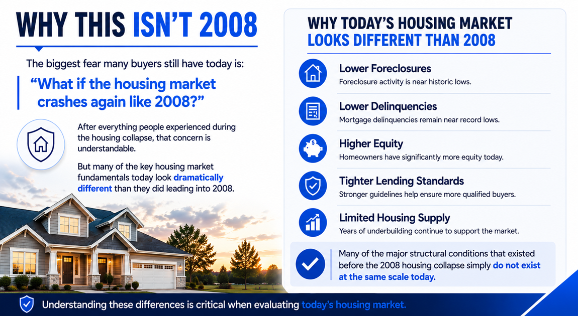
Why This Isn't 2008 — Core Strategy and Decision Context
Foreclosure Activity Today Looks Dramatically Different
During the housing collapse, foreclosure activity surged to historic levels.
Today, foreclosure activity remains significantly below the levels seen during the 2008 housing crisis.
That matters because foreclosure-driven inventory was one of the biggest factors that accelerated housing supply during the crash.
Today’s market looks very different.
Foreclosure Activity By Year — How the Process Works in Practice
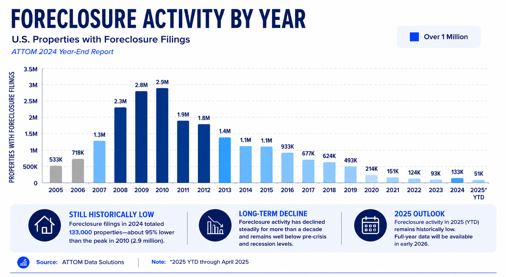
Foreclosure Activity By Year — How the Process Works in Practice
Mortgage Delinquencies Remain Near Historic Lows
Another major difference between today’s market and the housing crash is mortgage performance.
During the housing collapse:
➡️ Riskier Loan Structures Were Far More Common
➡️ Lending Standards Were Significantly Looser
➡️ Many Buyers Had Minimal Equity
➡️ Delinquencies Surged Rapidly
Today, many homeowners are sitting on:
➡️ Stronger Equity Positions
➡️ Fixed Mortgage Rates
➡️ Stronger Credit Profiles
➡️ Long-Term Low Monthly Payments
That has helped keep mortgage delinquency levels historically low compared to the years surrounding the housing crash.
Mortgage Delinquency Near Record Lows — Who This Resource Helps and Why
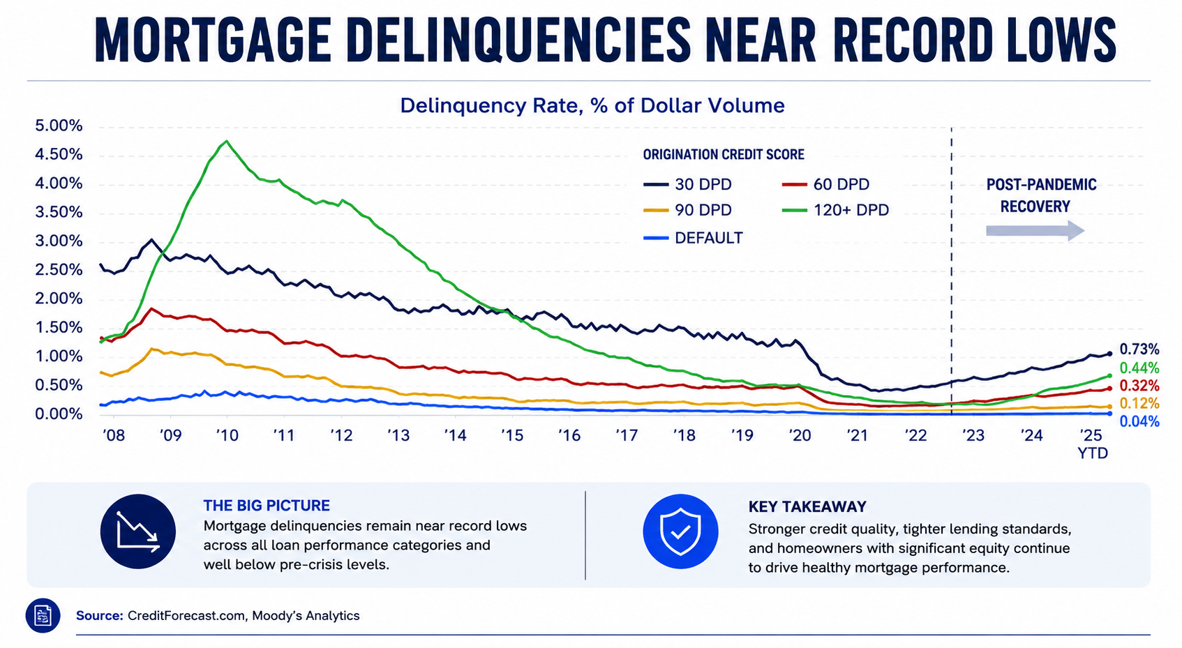
Mortgage Delinquency Near Record Lows — Who This Resource Helps and Why
One Of The Biggest Differences Today Is Equity
During the housing collapse, many homeowners had:
➡️ Little Equity
➡️ Minimal Down Payments
➡️ Adjustable Mortgage Payments
➡️ High Leverage
➡️ Limited Financial Cushion
Today, many homeowners are sitting on substantial tappable equity positions built through years of home appreciation and principal reduction.
That creates a fundamentally different housing market structure than the years leading up to 2008.
Then They "Cashed Out" Today They Have Equity
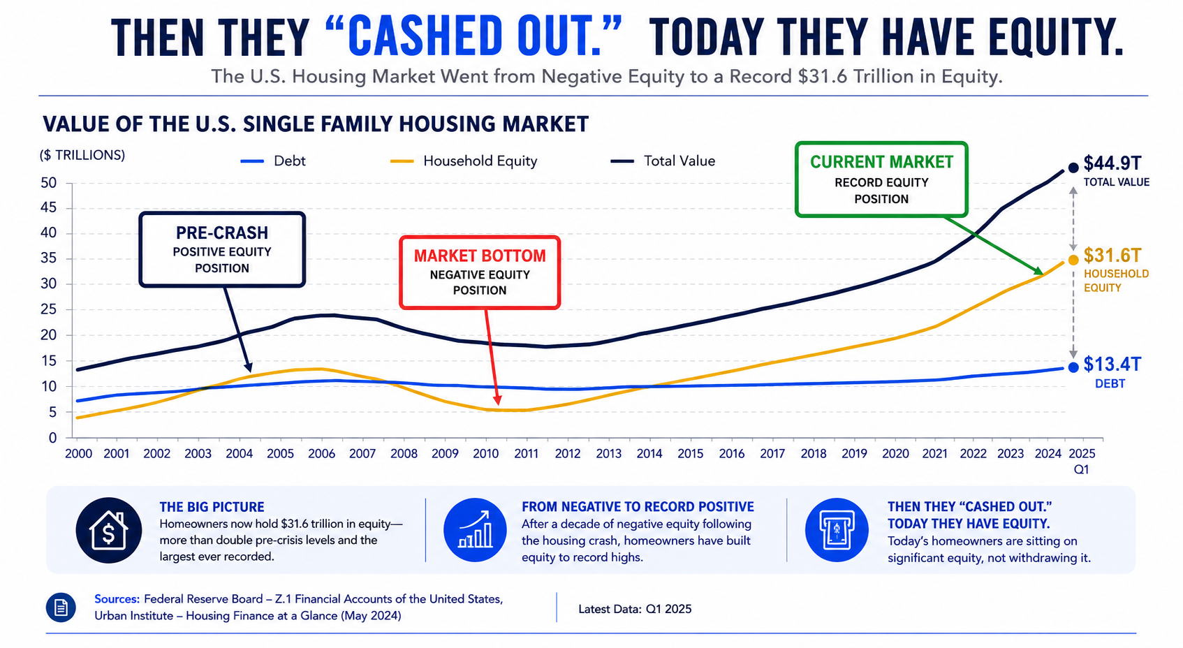
Then They "Cashed Out" Today They Have Equity
Tappable Equity Puts This Into Perspective
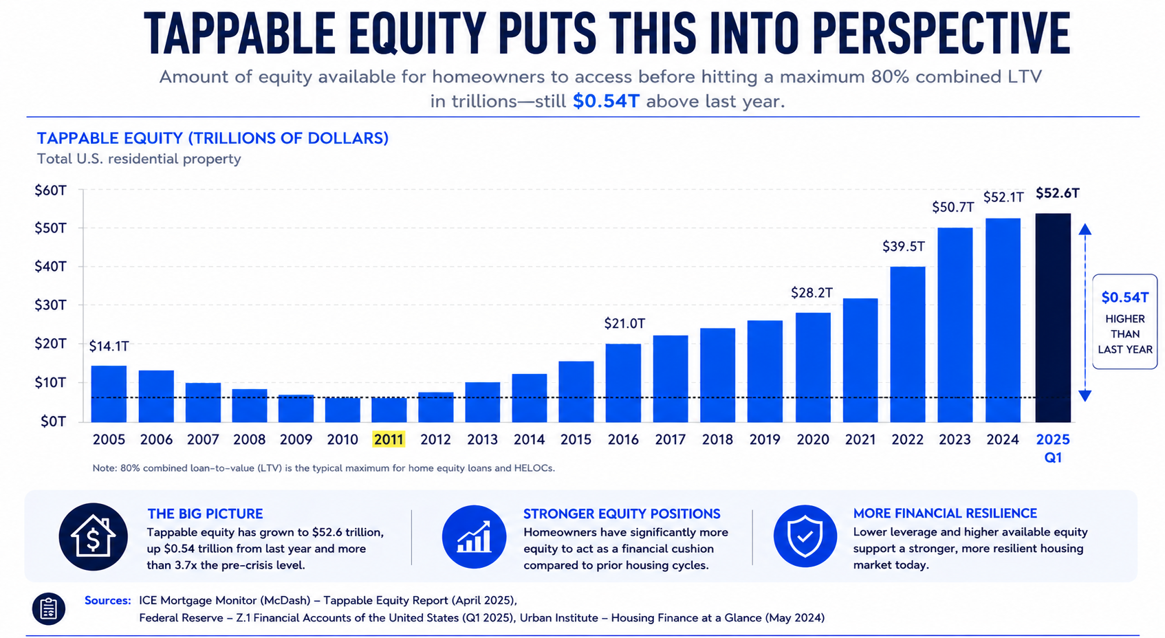
Tappable Equity Puts This Into Perspective
Home Values Have Increased Significantly Since The Pandemic
Housing supply constraints, limited inventory, demographic demand, and years of underbuilding helped drive substantial home appreciation across much of the country.
That appreciation created:
➡️ More Equity
➡️ Greater Financial Stability
➡️ Larger Equity Buffers
➡️ Stronger Owner Positions
And while appreciation rates may normalize over time, today’s housing market structure still looks very different than the environment leading into 2008.
Home Prices Appreciated By 57.8% Over The Last 5 Years
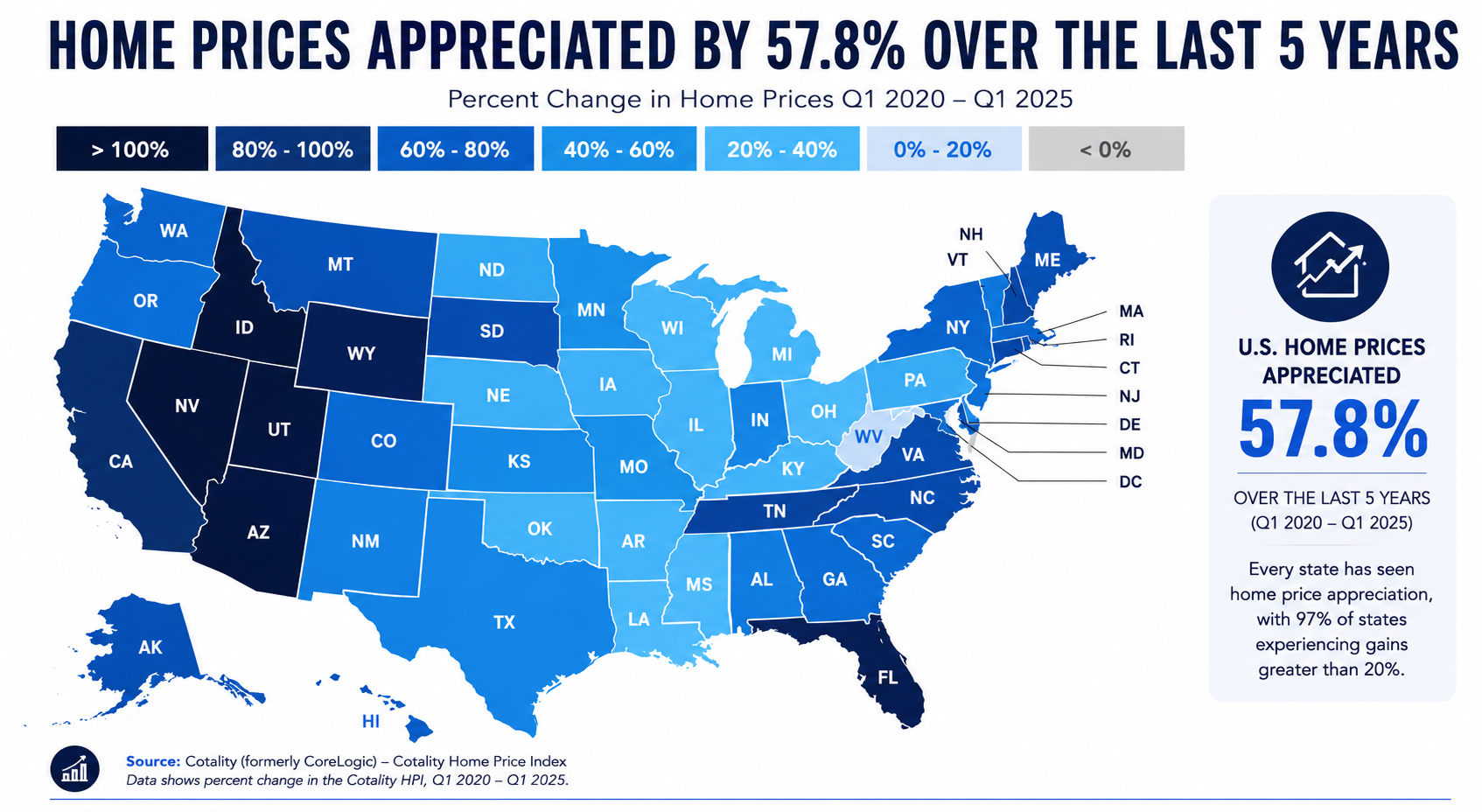
Home Prices Appreciated By 57.8% Over The Last 5 Years
Home Appreciation Pre-And-Post Pandemic — Timing Options and Informed Decision Making
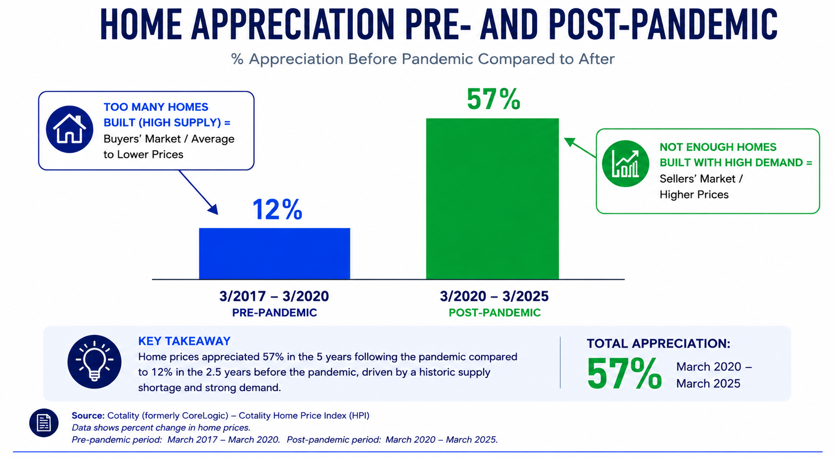
Home Appreciation Pre-And-Post Pandemic — Timing Options and Informed Decision Making
Many Of The Key Housing Variables Look Very Different Today
One of the biggest misconceptions in today’s market is assuming:
➡️ Higher Rates Automatically Mean Another Housing Crash
But housing markets are influenced by many variables beyond mortgage rates alone.
And many of the key variables today still look materially different from what they did before the 2008 collapse.
That includes:
➡️ Much Lower Foreclosure Activity
➡️ Lower Mortgage Delinquencies
➡️ Stronger Equity Positions
➡️ Tighter Lending Standards
➡️ Years Of Underbuilding
➡️ Limited Housing Supply
Key Housing Market Variables Then Vs. Now
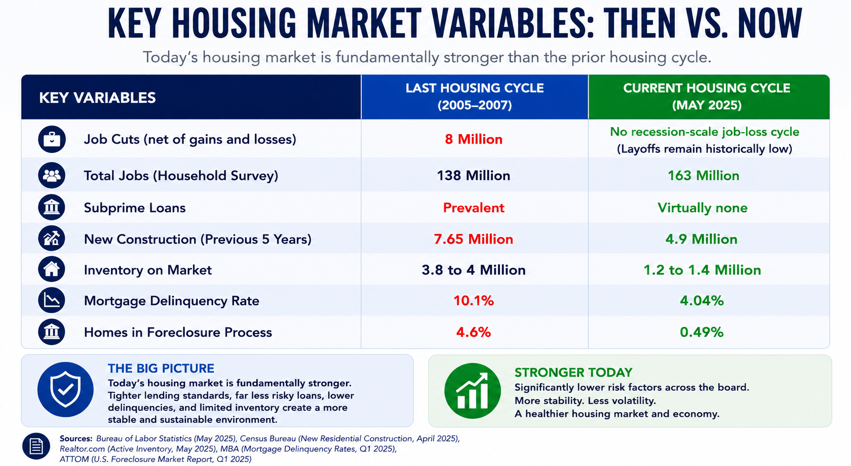
Key Housing Market Variables Then Vs. Now
Why Today’s Housing Market Looks Different Than 2008
➡️ Lower Foreclosures
➡️ Lower Delinquencies
➡️ Higher Equity
➡️ Tighter Lending Standards
➡️ Limited Housing Supply
What This Means For Today's Buyers
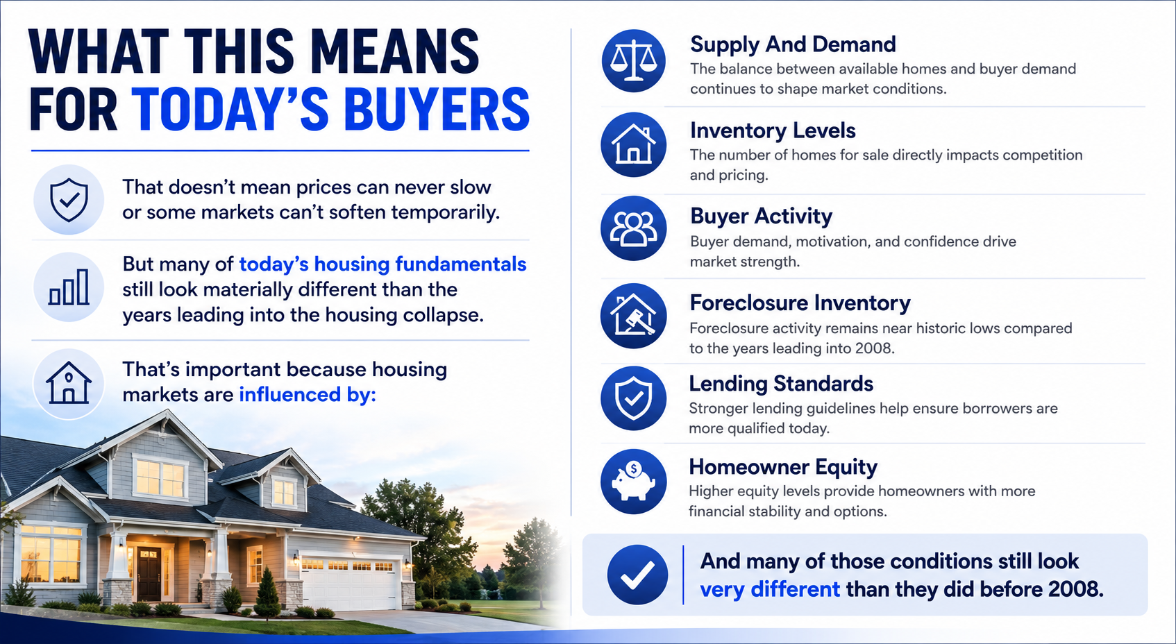
What This Means For Today's Buyers
The Housing Market Always Has Risks. But Today’s Market Structure Looks Very Different Than 2008.
Many of today’s housing market fundamentals still reflect:
➡️ Lower Foreclosure Activity
➡️ Lower Mortgage Delinquencies
➡️ Stronger Equity Positions
➡️ Tighter Lending Standards
➡️ Limited Housing Supply
➡️ Years Of Underbuilding
That’s why many analysts, economists, lenders, and housing professionals believe today’s market environment is fundamentally different from that of the years leading up to the housing collapse.
Understanding today’s housing market requires looking beyond headlines and understanding the full picture.
Why Today's Housing Market Looks Different Than 2008
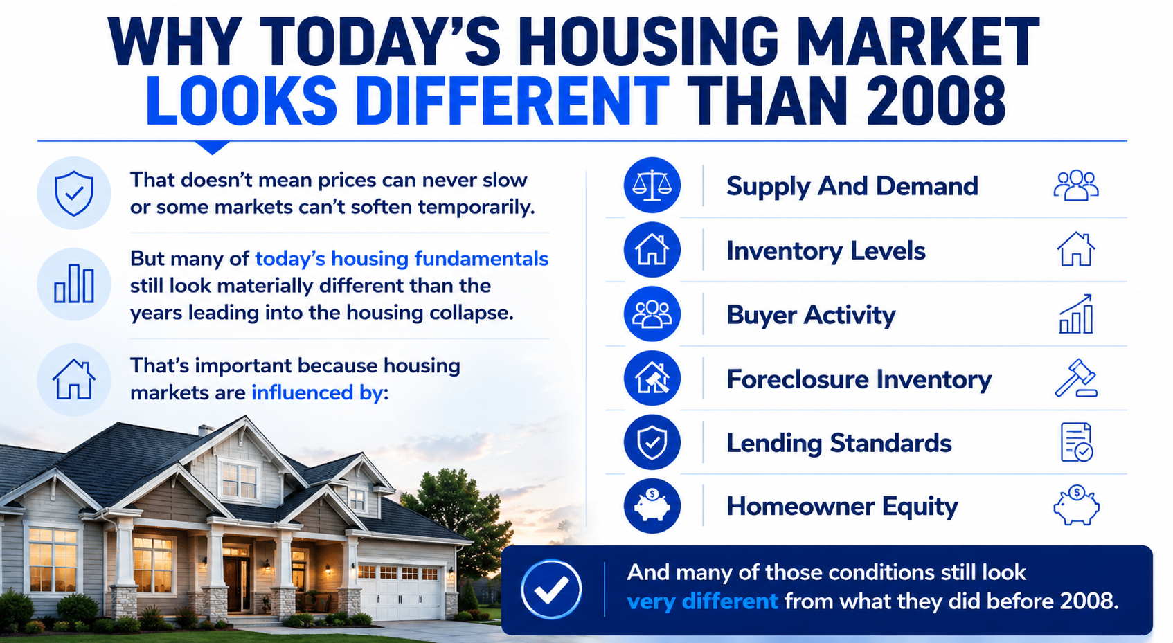
Why Today's Housing Market Looks Different Than 2008
Every Buyer’s Situation Is Different
The housing market is complex.
And unfortunately, many buyers today are hearing conflicting opinions, emotional headlines, social media hot takes, and one-size-fits-all advice without ever being shown the full picture.
That’s why this presentation series was created: to help buyers better understand the bigger picture of housing affordability, competition, leverage, market psychology, mortgage rates, and long-term financial strategy, and how these factors often work together rather than focusing on only one piece of the puzzle.
Click the links below to continue exploring the Housing Market Series:
➡️ The Supply Problem Most People Don’t Realize Exists
➡️ Why Do Home Prices Keep Rising?
➡️ What History Shows Us About Home Values
➡️ What Happens When Rates Drop?
➡️ Why Waiting Could Create More Competition
➡️ Why Today’s Buyers Still Have Opportunity
➡️ Today’s Buyers Have More Leverage Than They Think
If you’d like help understanding how these market dynamics may impact your specific situation, we’re happy to walk through the numbers with you and help you evaluate your options clearly and strategically.
➡️ Schedule Your Strategy Call Here
Best regards,
Michael Thayer, CMPS, CMA
NMLS #173264
Planet Home Lending, NMLS #17022
Explore Buyer & Seller Resources & Next Steps
+ −Market Timing vs. Market Strategy: When Is the Right Time to Buy... And More Importantly, Why?
Calculators & Loan Programs Questions Answered: Mortgage Programs & Financing Calculator
Smart Financing Strategies to Lower Your Monthly Mortgage Payment: Smart Mortgage Strategies & Financing Hacks
Homebuying Roadmap: Your Mortgage GPS
Moving To Middle Tennessee: Moving To Middle Tennessee Resource Center
Search Open Houses: View All Middle Tennessee Open Houses
Main Resource Hub: Buyers, Sellers, Realtors, and Builders Resources and Strategies
Additional Information & Reference Guides
+ −Welcome Video Transcript
+ −Video Transcript
00:00
One of the biggest fears that many buyers still have in today's market is
00:04
What if this turns into another 2008? And honestly, after everything people experienced during the housing collapse.
00:12
That concern is understandable.
00:14
But…
00:14
Another misconception in today's market is assuming that today's housing market looks anything like it did leading into 2008. I'm Michael Therm, a mortgage advisor based in Nashville, Tennessee, serving clients nationwide. And while no market is ever risk-free.
00:32
Many of the major housing fundamentals today look dramatically different from back then.
00:37
Foreclosures were surging then. Lending standards were loose at best. Adjustable-rate mortgage loans were everywhere. Many homeowners had little to no equity, and the housing market had a massive inventory oversupply. Versus today.
00:53
Many markets are still seeing lower foreclosure activity.
00:57
Mortgage delinquency levels are near historical lows, stronger homeowner equity, tighter lending standards, and years of not being able to build enough homes to meet the demand.
01:08
Now, that doesn't mean prices can never slow down.
01:11
But, it does mean today's housing market looks very different than the environment leading into 2008. This presentation walks you through the actual data, the actual housing fundamentals, and the key differences many buyers still don't fully understand today, because understanding the full picture
01:29
matters more than reacting to the headlines alone. Click below, explore the full breakdown, and we'll talk to you soon.
Why This Isn't 2008 — Core Strategy and Decision Context Image Overview
+ −What this image communicates
The purpose of “Why This Isn't 2008 — Core Strategy and Decision Context” is to organize one part of “Why This Isn’t 2008 Again” around a central strategy. It helps the reader understand how to state the main tension clearly and show which decision should be made before secondary details distract from it and keeps the discussion centered on what the chart or comparison says about supply, demand, prices, rates, equity, leverage, or competition at the geography and period actually measured. The image frames “Why This Isn't 2008” as a question that cannot be answered responsibly from a slogan. Its visual emphasis is an invitation to test the premise against the reader's actual property, finances, timing, and goals. That question-led design is useful because it creates a pause between interest and action and makes the missing evidence easier to name.
Why it belongs on this page
The 2008 comparison uses foreclosure, delinquency, homeowner equity, appreciation, and then-versus-now variables to explain why today's housing system has a different risk profile. The central strategy role of “Why This Isn't 2008” is the reason this image belongs at this point in “Why This Isn’t 2008 Again.”
How a reader can use it
Use “Why This Isn't 2008” for its stated central strategy job on “Why This Isn’t 2008 Again.” Name the desired outcome, identify the constraint that could block it, and decide which evidence would change the answer. The working notes for this panel should record the desired result, the assumption carrying the most risk, the fact that would disprove it, and the decision that must be made first. That record lets the reader use market context to improve timing and negotiation questions without converting a broad statistic into a property-level prediction without asking this image to answer a different stage of the decision.
What still must be verified
The image is valuable because it frames the right issue, not because it proves the answer. National or regional data cannot establish a specific home's value, condition, future appreciation, market time, offer activity, or the result of waiting. “Why This Isn't 2008 — Core Strategy and Decision Context” remains educational until the current borrower, property, market, and transaction evidence supports a specific conclusion. On “Why This Isn’t 2008 Again,” that safeguard applies specifically to the central strategy role assigned to “Why This Isn't 2008.”
Foreclosure Activity By Year — How the Process Works in Practice Image Overview
+ −What this image communicates
The image titled “Foreclosure Activity By Year — How the Process Works in Practice” gives “Why This Isn’t 2008 Again” a focused working sequence. Its communication job is to show the order of operations, the handoff between people, and the checkpoint that determines whether the next step is ready. In this page context, the underlying subject is housing-market evidence: what the chart or comparison says about supply, demand, prices, rates, equity, leverage, or competition at the geography and period actually measured. The graphic foregrounds the measured or numbered claim in “Foreclosure Activity By Year” so the reader can see the scale, sequence, or direction being discussed. Numbers in this format are meaningful only with their date range, geography, unit, source, and comparison point. The visual's job is to make the pattern understandable while keeping the underlying measurement visible as a separate verification task.
Why it belongs on this page
The ten images are not interchangeable; each adds one piece of the comparison. The working sequence role of “Foreclosure Activity By Year” is the reason this image belongs at this point in “Why This Isn’t 2008 Again.”
How a reader can use it
Use “Foreclosure Activity By Year” for its stated working sequence job on “Why This Isn’t 2008 Again.” Read the visual from the first confirmed fact through the next action, noting dependencies, deadlines, and the owner of each task. The working notes for this panel should record the starting condition, each dependent step, the responsible person, the handoff document, the deadline, and the condition required to advance. That record lets the reader use market context to improve timing and negotiation questions without converting a broad statistic into a property-level prediction without asking this image to answer a different stage of the decision.
What still must be verified
The image is valuable because it frames the right issue, not because it proves the answer. National or regional data cannot establish a specific home's value, condition, future appreciation, market time, offer activity, or the result of waiting. “Foreclosure Activity By Year — How the Process Works in Practice” remains educational until the current borrower, property, market, and transaction evidence supports a specific conclusion. On “Why This Isn’t 2008 Again,” that safeguard applies specifically to the working sequence role assigned to “Foreclosure Activity By Year.”
Mortgage Delinquency Near Record Lows — Who This Resource Helps and Why Image Overview
+ −What this image communicates
A reader encountering “Mortgage Delinquency Near Record Lows — Who This Resource Helps and Why” should immediately recognize the housing-market evidence question inside “Why This Isn’t 2008 Again.” The visual's role is reader and use-case map, so it must explain who benefits, what problem each person is trying to solve, and why the same information may lead to different questions rather than merely repeat the headline. The graphic foregrounds the measured or numbered claim in “Mortgage Delinquency Near Record Lows” so the reader can see the scale, sequence, or direction being discussed. Numbers in this format are meaningful only with their date range, geography, unit, source, and comparison point. The visual's job is to make the pattern understandable while keeping the underlying measurement visible as a separate verification task.
Why it belongs on this page
They should help readers understand systemic differences without minimizing household hardship or claiming that equity and low delinquency make every owner, market, or future price path safe. The reader and use-case map role of “Mortgage Delinquency Near Record Lows” is the reason this image belongs at this point in “Why This Isn’t 2008 Again.”
How a reader can use it
Use “Mortgage Delinquency Near Record Lows” for its stated reader and use-case map job on “Why This Isn’t 2008 Again.” Match the graphic to the reader's role, current stage, pressure, and decision authority before applying its guidance. The working notes for this panel should record who the guidance is for, the reader's current stage, the decision they control, the problem they need solved, and when a specialist must take over. That record lets the reader use market context to improve timing and negotiation questions without converting a broad statistic into a property-level prediction without asking this image to answer a different stage of the decision.
What still must be verified
The final safeguard is verification. National or regional data cannot establish a specific home's value, condition, future appreciation, market time, offer activity, or the result of waiting. A reader should leave “Mortgage Delinquency Near Record Lows — Who This Resource Helps and Why” knowing what to ask and what to gather—not believing that a graphic has already supplied an approval, valuation, legal conclusion, or guaranteed outcome. On “Why This Isn’t 2008 Again,” that safeguard applies specifically to the reader and use-case map role assigned to “Mortgage Delinquency Near Record Lows.”
Then They "Cashed Out" Today They Have Equity Image Overview
+ −What this image communicates
The visible message in “Then They "Cashed Out" Today They Have Equity” directs attention to housing-market evidence on “Why This Isn’t 2008 Again.” The image functions as a primary visual message: it should make one topic recognizable at a glance and give the reader a clear entry point into the deeper explanation on the page. That gives the reader a specific reason to slow down before acting. The image makes “Then They "Cashed Out" Today They Have Equity” the dominant visual message and gives the reader a defined entry point into the page's argument. The wording identifies what deserves attention first; the surrounding design establishes whether the reader is looking at a claim, a choice, a sequence, or a practical resource. That distinction determines what evidence should be gathered before the message is applied.
Why it belongs on this page
The 2008 comparison uses foreclosure, delinquency, homeowner equity, appreciation, and then-versus-now variables to explain why today's housing system has a different risk profile. The primary visual message role of “Then They "Cashed Out" Today They Have Equity” is the reason this image belongs at this point in “Why This Isn’t 2008 Again.”
The exact story carried by this graphic
“Then they cashed out; today they have equity” is a balance-sheet comparison, not a claim that every present homeowner is financially safe. The visual asks the reader to distinguish debt extracted from a property from value retained in it. In a 2008 comparison, that distinction affects foreclosure exposure, the ability to sell, and how much price movement a homeowner can absorb before the mortgage exceeds the property's value. Today, equity can create a buffer and additional choices, but it is not the same as cash on hand and can be reduced by selling costs, additional liens, or falling value. The responsible reading is to compare verified mortgage balances and current property evidence rather than turn a broad market observation into a conclusion about one household.
How a reader can use it
Use “Then They "Cashed Out" Today They Have Equity” for its stated primary visual message job on “Why This Isn’t 2008 Again.” Identify the claim, chart, comparison, process, property feature, or strategy shown and connect it to the exact decision the page addresses. The working notes for this panel should record the literal claim or comparison shown, the page fact it supports, the source behind that fact, and the decision the reader should make next. That record lets the reader use market context to improve timing and negotiation questions without converting a broad statistic into a property-level prediction without asking this image to answer a different stage of the decision.
What still must be verified
Keep the visual in its proper role. National or regional data cannot establish a specific home's value, condition, future appreciation, market time, offer activity, or the result of waiting. If a later disclosure, source update, appraisal, inspection, title item, program rule, or contract term conflicts with “Then They "Cashed Out" Today They Have Equity,” the current controlling evidence takes priority. On “Why This Isn’t 2008 Again,” that safeguard applies specifically to the primary visual message role assigned to “Then They "Cashed Out" Today They Have Equity.”
Tappable Equity Puts This Into Perspective Image Overview
+ −What this image communicates
The image titled “Tappable Equity Puts This Into Perspective” gives “Why This Isn’t 2008 Again” a focused primary visual message. Its communication job is to make one topic recognizable at a glance and give the reader a clear entry point into the deeper explanation on the page. In this page context, the underlying subject is housing-market evidence: what the chart or comparison says about supply, demand, prices, rates, equity, leverage, or competition at the geography and period actually measured. The image makes “Tappable Equity Puts This Into Perspective” the dominant visual message and gives the reader a defined entry point into the page's argument. The wording identifies what deserves attention first; the surrounding design establishes whether the reader is looking at a claim, a choice, a sequence, or a practical resource. That distinction determines what evidence should be gathered before the message is applied.
Why it belongs on this page
The ten images are not interchangeable; each adds one piece of the comparison. The primary visual message role of “Tappable Equity Puts This Into Perspective” is the reason this image belongs at this point in “Why This Isn’t 2008 Again.”
How a reader can use it
Use “Tappable Equity Puts This Into Perspective” for its stated primary visual message job on “Why This Isn’t 2008 Again.” Identify the claim, chart, comparison, process, property feature, or strategy shown and connect it to the exact decision the page addresses. The working notes for this panel should record the literal claim or comparison shown, the page fact it supports, the source behind that fact, and the decision the reader should make next. That record lets the reader use market context to improve timing and negotiation questions without converting a broad statistic into a property-level prediction without asking this image to answer a different stage of the decision.
What still must be verified
The final safeguard is verification. National or regional data cannot establish a specific home's value, condition, future appreciation, market time, offer activity, or the result of waiting. A reader should leave “Tappable Equity Puts This Into Perspective” knowing what to ask and what to gather—not believing that a graphic has already supplied an approval, valuation, legal conclusion, or guaranteed outcome. On “Why This Isn’t 2008 Again,” that safeguard applies specifically to the primary visual message role assigned to “Tappable Equity Puts This Into Perspective.”
Home Prices Appreciated By 57.8% Over The Last 5 Years Image Overview
+ −What this image communicates
A reader encountering “Home Prices Appreciated By 57.8% Over The Last 5 Years” should immediately recognize the housing-market evidence question inside “Why This Isn’t 2008 Again.” The visual's role is primary visual message, so it must make one topic recognizable at a glance and give the reader a clear entry point into the deeper explanation on the page rather than merely repeat the headline. The graphic foregrounds the measured or numbered claim in “Home Prices Appreciated By 57.8% Over The Last 5 Years” so the reader can see the scale, sequence, or direction being discussed. Numbers in this format are meaningful only with their date range, geography, unit, source, and comparison point. The visual's job is to make the pattern understandable while keeping the underlying measurement visible as a separate verification task.
Why it belongs on this page
They should help readers understand systemic differences without minimizing household hardship or claiming that equity and low delinquency make every owner, market, or future price path safe. The primary visual message role of “Home Prices Appreciated By 57.8% Over The Last 5 Years” is the reason this image belongs at this point in “Why This Isn’t 2008 Again.”
The exact story carried by this graphic
The 57.8% figure shown in this image is a cumulative historical appreciation statement for the period identified by the source behind the page. Its purpose is to show how a multi-year price change can alter homeowner equity and the starting point for a market comparison. It does not mean each home rose by exactly that amount, that the gain occurred evenly, or that the next five years will repeat the same path. Location, property type, condition, improvements, purchase date, liens, and transaction costs all affect the owner-level result. Readers should use the graphic to separate a broad historical trend from a current valuation and then obtain property-specific comparable sales or an appraisal before relying on the number.
How a reader can use it
Use “Home Prices Appreciated By 57.8% Over The Last 5 Years” for its stated primary visual message job on “Why This Isn’t 2008 Again.” Identify the claim, chart, comparison, process, property feature, or strategy shown and connect it to the exact decision the page addresses. The working notes for this panel should record the literal claim or comparison shown, the page fact it supports, the source behind that fact, and the decision the reader should make next. That record lets the reader use market context to improve timing and negotiation questions without converting a broad statistic into a property-level prediction without asking this image to answer a different stage of the decision.
What still must be verified
“Home Prices Appreciated By 57.8% Over The Last 5 Years” organizes the primary visual message part of the decision; it does not settle the rest. National or regional data cannot establish a specific home's value, condition, future appreciation, market time, offer activity, or the result of waiting. The responsible next step after “Home Prices Appreciated By 57.8% Over The Last 5 Years” is to obtain the current document or finding that governs the issue and reconcile any difference before proceeding. On “Why This Isn’t 2008 Again,” that safeguard applies specifically to the primary visual message role assigned to “Home Prices Appreciated By 57.8% Over The Last 5 Years.”
Home Appreciation Pre-And-Post Pandemic — Timing Options and Informed Decision Making Image Overview
+ −What this image communicates
The “Home Appreciation Pre-And-Post Pandemic — Timing Options and Informed Decision Making” image turns the central issue on “Why This Isn’t 2008 Again” into a visible timing and option map. It is there to show how acting now, waiting, or changing sequence affects choice, leverage, carrying cost, and exposure to future conditions, while the page supplies the evidence and explanation needed to evaluate what the chart or comparison says about supply, demand, prices, rates, equity, leverage, or competition at the geography and period actually measured. The graphic foregrounds the measured or numbered claim in “Home Appreciation Pre-And-Post Pandemic” so the reader can see the scale, sequence, or direction being discussed. Numbers in this format are meaningful only with their date range, geography, unit, source, and comparison point. The visual's job is to make the pattern understandable while keeping the underlying measurement visible as a separate verification task.
Why it belongs on this page
The 2008 comparison uses foreclosure, delinquency, homeowner equity, appreciation, and then-versus-now variables to explain why today's housing system has a different risk profile. The timing and option map role of “Home Appreciation Pre-And-Post Pandemic” is the reason this image belongs at this point in “Why This Isn’t 2008 Again.”
How a reader can use it
Use “Home Appreciation Pre-And-Post Pandemic” for its stated timing and option map job on “Why This Isn’t 2008 Again.” Compare decision dates, expiration points, contract milestones, and the consequence of delay instead of assuming more time is always safer. The working notes for this panel should record decision dates, expiration points, contract milestones, carrying periods, lock or approval windows, and what changes if action is delayed. That record lets the reader use market context to improve timing and negotiation questions without converting a broad statistic into a property-level prediction without asking this image to answer a different stage of the decision.
What still must be verified
National or regional data cannot establish a specific home's value, condition, future appreciation, market time, offer activity, or the result of waiting. “Home Appreciation Pre-And-Post Pandemic — Timing Options and Informed Decision Making” should therefore be treated as a timing and option map, not as transaction evidence by itself. Current documents, responsible sources, and the professionals accountable for the relevant decision must control when they differ from the illustration. On “Why This Isn’t 2008 Again,” that safeguard applies specifically to the timing and option map role assigned to “Home Appreciation Pre-And-Post Pandemic.”
Key Housing Market Variables Then Vs. Now Image Overview
+ −What this image communicates
“Key Housing Market Variables Then Vs. Now” establishes the visual entry point for this part of “Why This Isn’t 2008 Again.” Its primary visual message framing helps the reader understand how to make one topic recognizable at a glance and give the reader a clear entry point into the deeper explanation on the page. The decision underneath the graphic is what the chart or comparison says about supply, demand, prices, rates, equity, leverage, or competition at the geography and period actually measured. The visual uses a side-by-side comparison to separate “Key Housing Market Variables Then Vs. Now” into alternatives that should not be treated as interchangeable. Its layout asks the reader to compare structure, cost, timing, eligibility, and consequence—not select a winner from one headline number. The comparison is therefore a decision aid, with each column pointing to a different fact that must be confirmed.
Why it belongs on this page
The ten images are not interchangeable; each adds one piece of the comparison. The primary visual message role of “Key Housing Market Variables Then Vs. Now” is the reason this image belongs at this point in “Why This Isn’t 2008 Again.”
How a reader can use it
Use “Key Housing Market Variables Then Vs. Now” for its stated primary visual message job on “Why This Isn’t 2008 Again.” Identify the claim, chart, comparison, process, property feature, or strategy shown and connect it to the exact decision the page addresses. The working notes for this panel should record the literal claim or comparison shown, the page fact it supports, the source behind that fact, and the decision the reader should make next. That record lets the reader use market context to improve timing and negotiation questions without converting a broad statistic into a property-level prediction without asking this image to answer a different stage of the decision.
What still must be verified
“Key Housing Market Variables Then Vs. Now” organizes the primary visual message part of the decision; it does not settle the rest. National or regional data cannot establish a specific home's value, condition, future appreciation, market time, offer activity, or the result of waiting. The responsible next step after “Key Housing Market Variables Then Vs. Now” is to obtain the current document or finding that governs the issue and reconcile any difference before proceeding. On “Why This Isn’t 2008 Again,” that safeguard applies specifically to the primary visual message role assigned to “Key Housing Market Variables Then Vs. Now.”
What This Means For Today's Buyers Image Overview
+ −What this image communicates
A reader encountering “What This Means For Today's Buyers” should immediately recognize the housing-market evidence question inside “Why This Isn’t 2008 Again.” The visual's role is primary visual message, so it must make one topic recognizable at a glance and give the reader a clear entry point into the deeper explanation on the page rather than merely repeat the headline. The visual centers “What This Means For Today's Buyers” on a specific housing or listing decision. It connects the visible promise to the property, the people involved, and the transaction sequence instead of leaving the message as abstract marketing. A useful reading separates what can be illustrated now from what still depends on the home's condition, the negotiated terms, verified financing, and current market response.
Why it belongs on this page
They should help readers understand systemic differences without minimizing household hardship or claiming that equity and low delinquency make every owner, market, or future price path safe. The primary visual message role of “What This Means For Today's Buyers” is the reason this image belongs at this point in “Why This Isn’t 2008 Again.”
How a reader can use it
Use “What This Means For Today's Buyers” for its stated primary visual message job on “Why This Isn’t 2008 Again.” Identify the claim, chart, comparison, process, property feature, or strategy shown and connect it to the exact decision the page addresses. The working notes for this panel should record the literal claim or comparison shown, the page fact it supports, the source behind that fact, and the decision the reader should make next. That record lets the reader use market context to improve timing and negotiation questions without converting a broad statistic into a property-level prediction without asking this image to answer a different stage of the decision.
What still must be verified
“What This Means For Today's Buyers” organizes the primary visual message part of the decision; it does not settle the rest. National or regional data cannot establish a specific home's value, condition, future appreciation, market time, offer activity, or the result of waiting. The responsible next step after “What This Means For Today's Buyers” is to obtain the current document or finding that governs the issue and reconcile any difference before proceeding. On “Why This Isn’t 2008 Again,” that safeguard applies specifically to the primary visual message role assigned to “What This Means For Today's Buyers.”
Why Today's Housing Market Looks Different Than 2008 Image Overview
+ −What this image communicates
On “Why This Isn’t 2008 Again,” the “Why Today's Housing Market Looks Different Than 2008” visual isolates one decision from a larger housing conversation. As a primary visual message, it is meant to make one topic recognizable at a glance and give the reader a clear entry point into the deeper explanation on the page. The subject belongs to housing-market evidence, where the useful question is what the chart or comparison says about supply, demand, prices, rates, equity, leverage, or competition at the geography and period actually measured. The image frames “Why Today's Housing Market Looks Different Than 2008” as a question that cannot be answered responsibly from a slogan. Its visual emphasis is an invitation to test the premise against the reader's actual property, finances, timing, and goals. That question-led design is useful because it creates a pause between interest and action and makes the missing evidence easier to name.
Why it belongs on this page
The 2008 comparison uses foreclosure, delinquency, homeowner equity, appreciation, and then-versus-now variables to explain why today's housing system has a different risk profile. The primary visual message role of “Why Today's Housing Market Looks Different Than 2008” is the reason this image belongs at this point in “Why This Isn’t 2008 Again.”
How a reader can use it
Use “Why Today's Housing Market Looks Different Than 2008” for its stated primary visual message job on “Why This Isn’t 2008 Again.” Identify the claim, chart, comparison, process, property feature, or strategy shown and connect it to the exact decision the page addresses. The working notes for this panel should record the literal claim or comparison shown, the page fact it supports, the source behind that fact, and the decision the reader should make next. That record lets the reader use market context to improve timing and negotiation questions without converting a broad statistic into a property-level prediction without asking this image to answer a different stage of the decision.
What still must be verified
The final safeguard is verification. National or regional data cannot establish a specific home's value, condition, future appreciation, market time, offer activity, or the result of waiting. A reader should leave “Why Today's Housing Market Looks Different Than 2008” knowing what to ask and what to gather—not believing that a graphic has already supplied an approval, valuation, legal conclusion, or guaranteed outcome. On “Why This Isn’t 2008 Again,” that safeguard applies specifically to the primary visual message role assigned to “Why Today's Housing Market Looks Different Than 2008.”